Littlelines Responds

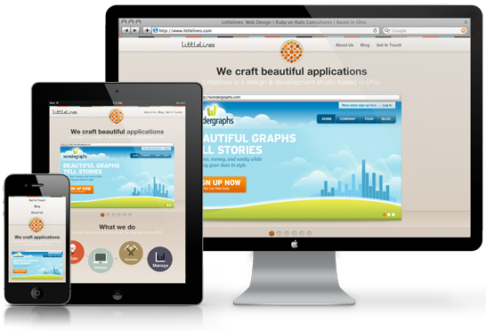
Ever since I read the blog article by Ethan Marcotte and heard people at conferences start murmuring about this new idea called ‘Responsive Design’ I have been hooked. This interest went deep enough to warrant a number of papers throughout my graduate school career devoted to analyzing the recent trends surrounding responsive and adaptive design. Needless to say I was thrilled when I found out that my new co-workers shared every bit of my enthusiasm. They had styled their very own site, https://littlelines.com in a mobile-first, responsive manner and it looked great on every device I could find to play with at home (I’m a self-titled professional geek so that gadget list is not inconsequential).
Upon checking out some of their source code I stumbled across a snippet that I thought was worthy of its very own blog post. During the initial development of their new site, they had setup their own custom SASS mixin to handle device detection. A mixin in SASS is a chunk of CSS that is reusable similar to a reusable method in Object Oriented Programming.
=respond-to($device)
  @if $device == handheld
    @media only screen and (min-width : 320px)
      @content

  @if $device == tablet
    @media only screen and (min-width : 600px)
      @content

  @if $device == tablet-landscape
    @media only screen and (min-width : 600px) and (orientation : landscape)
      @content

  @if $device == tablet-portrait
    @media only screen and (min-width : 600px) and (orientation : portrait)
      @content

  @if $device == tablet-large
    @media only screen and (min-width : 768px)
      @content

  @if $device == desktop
    @media only screen and (min-width : 1024px)
      @content

  @if $device == desktop-large
    @media only screen and (min-width : 1824px)
      @content

  @if $device == retina-display
    @media only screen and (-webkit-min-device-pixel-ratio: 2)
      @content
This mixin not only handled all device detection (via media queries), but did so in a mobile-first approach. This approach involves tackling the challenges of styling the mobile version of a site first and increasing in size from there (e-book, tablet, desktop, etc). Traditionally, when using media queries in CSS to handle device detection, all of the styles for a particular device are chunked together in the same part of the stylesheet. With the custom mixin, you are able to append a responsive style (using +respond_to(device_type)) within any specific style rule in SASS. This makes it quicker and easier to find and read any styles for a given site or application as all rules for a particular element are in the same place regardless of device. Ultimately, this makes adjusting a design to fit a myriad of devices second nature when tackling front-end development. This ensures continued focus on making sure site and applications give users an enjoyable experience regardless of their context or device of choice.
Below is a short example of the custom SASS mixin we use. Feel free to use/modify these snippets on your own projects - your mobile users will thank you!
h2
  color: #523611
  font-weight: bold
  margin-bottom: 1.0em
  +respond-to(handheld)
    font-size: 1.0em
    text-align: center
  +respond-to(tablet)
    font-size: 1.2em
    text-align: left
  +respond-to(desktop)
    font-size: 1.5em
